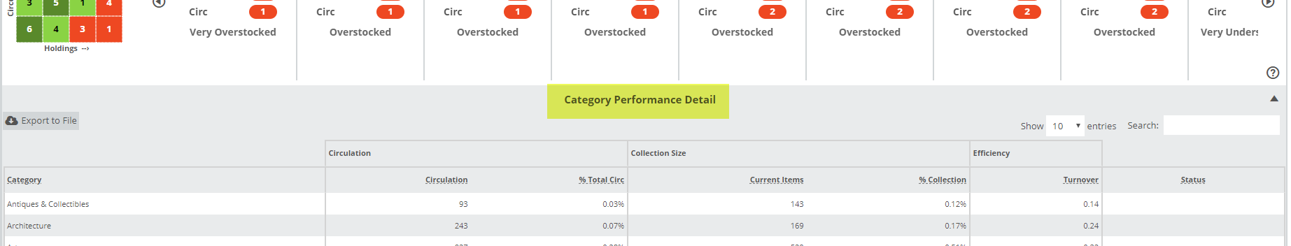
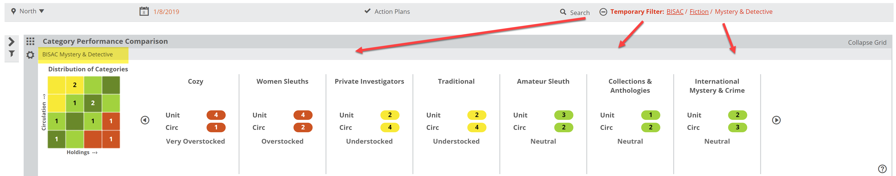
Once you’ve used the Category Performance Comparison graph to get a view of categories for which you’d like to see more detail, click Open Category Summary Report:
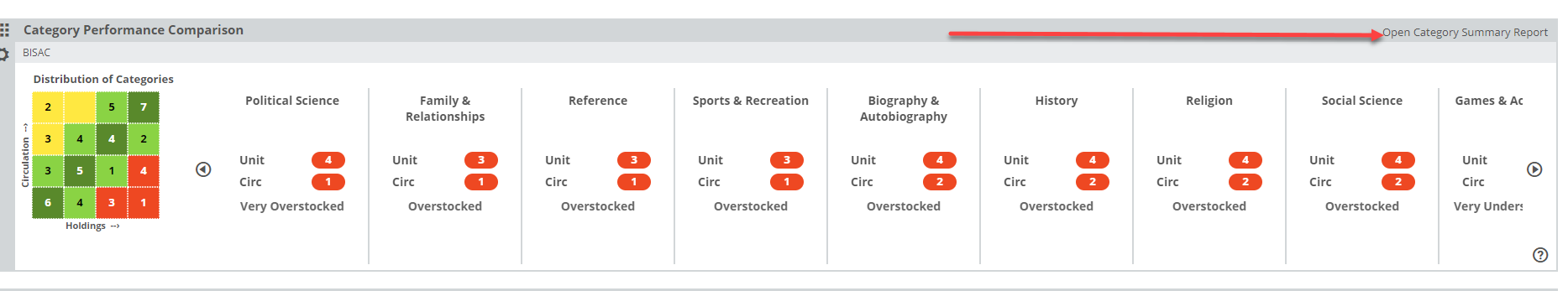
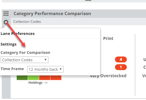
You’ll see a detailed breakdown of the current category selections, broken down according to Circulation, Collection Size, and Annual Turnover. Keep in mind that the information provided in this chart will be based on the time frame you select in your filter parameters here:
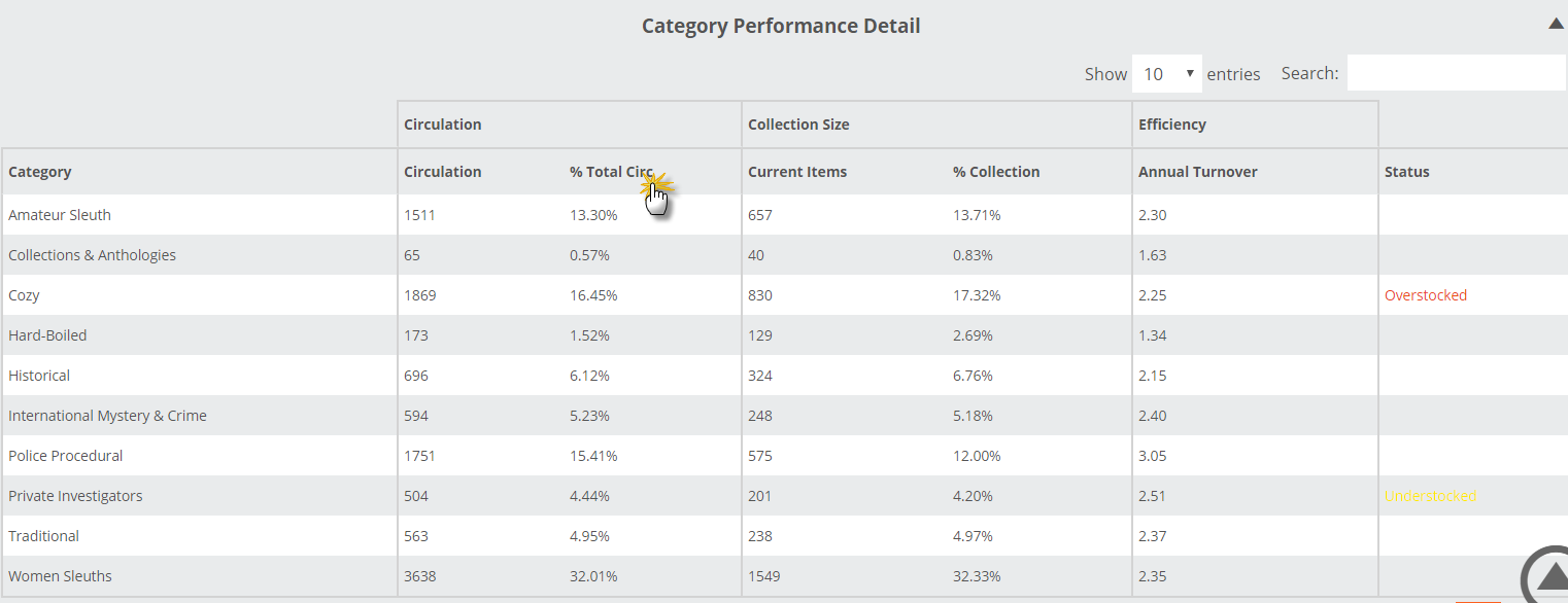
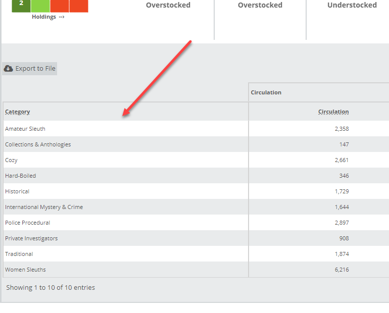
The chart will look like so:
Here’s what each column means:
Category: These are the categories that are represented in the graph, however you’ve chosen to filter and dive in.
Circulation: Total circulation of titles within that category in the specified time frame. In the example above, this library circulated 1751 Police Procedural mystery books in the last year.
% Total Circ: In the example above, all the sub-categories shown in the chart represent all titles at this library that fall under the Mystery classification. So here we can see that Women Sleuths out-circulates the other mystery genres, accounting for a hefty 32% of the total mystery circs.
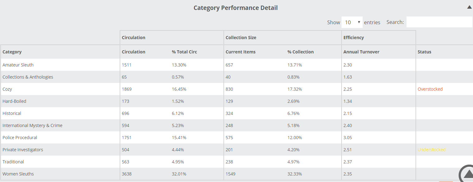
Current Items: Total number of ‘units’ owned in a particular category. In the image above, you can see that this library has 1869 Cozy mysteries in their collection, and 3638 books that publishers have classified as Women Sleuths.
% Inventory: The percentage of the larger collection each of these sub-categories represent. Cozy mysteries account for 16.45% of this library’s Mystery titles. The idea is to compare the % Total Circ number with the % Collection to make sure your offerings are commensurate with what your customers want. In this case, Women Sleuths represent about 32% of this library’s Mystery titles, and a whopping 32% of the Mystery circs. That’s pretty great.
Annual Turnover: Turns are a 12 month calculation, Circulation divided by Collection, and indicates the number of times over the course of a year this category will turnover. The higher the turns, the better, really. To increase turns, you can increase circulation or decrease the size of the collection. Often what needs to happen here is a round of somewhat aggressive weeding and a look at what else circs well that you may be missing.
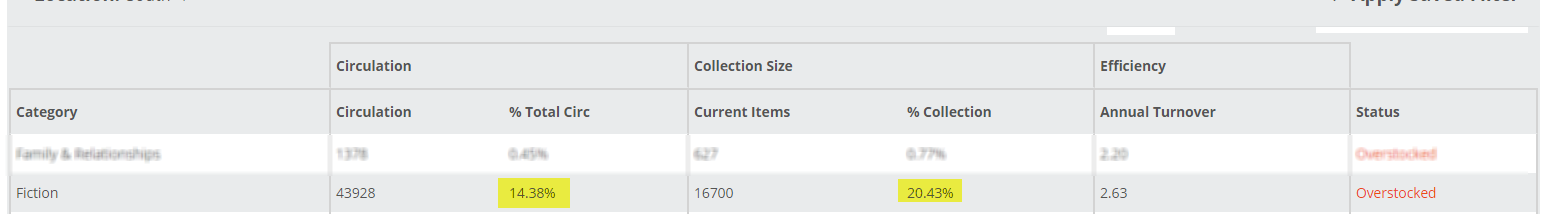
Status: Overstocked, Understocked, or Neutral. The image above shows that Fiction accounts for over 20% of this library’s titles, but less than 15% of the circulation. Once the discrepancy between those two percentages gets big enough, this tool will flag it with an Overstocked or Understocked Status.
Note, you can sort this chart by any of these columns by simply clicking on the column header. It can be convenient to sort the chart to list your categories from highest to lowest circ, etc.