The Historical Overview lane is really pretty simple:
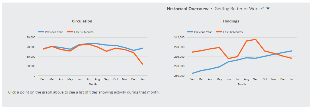
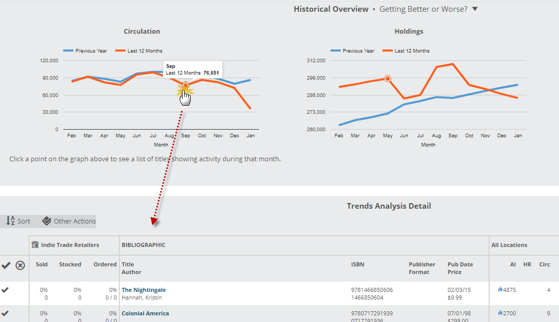
You can quickly see, for whichever Saved Filter you have in place, monthly Circulation and Holdings levels for the last few years. As the labels on the graph indicates, the red line represents the last 12 months and the blue line represents the 12 months previous. Assuming we have that amount of data from your library, you’ll see at a glance how all, or a specific portion of your collection has been circulating for the last few years. Whether for budgeting purposes, program or display planning, etc. this information can be pretty useful.
Hover over a spot on the graph to get the total circulation number of that month:

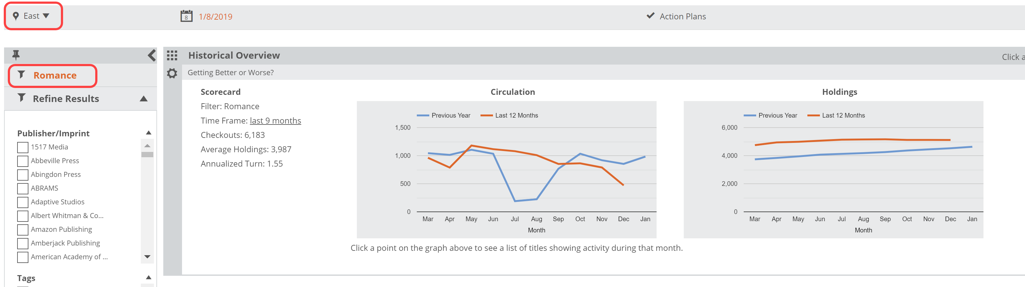
You can view specific branches using the Location Selector at the top of your Analytics page:

And as mentioned above, your Saved Filters will customize your Trends Analysis view. For example, you can see how circulation has trended for Cookbooks over the last 2 years at one of your branches:
Click any month to get a list of relevant titles. For example, click to see which specific titles circulated last September: