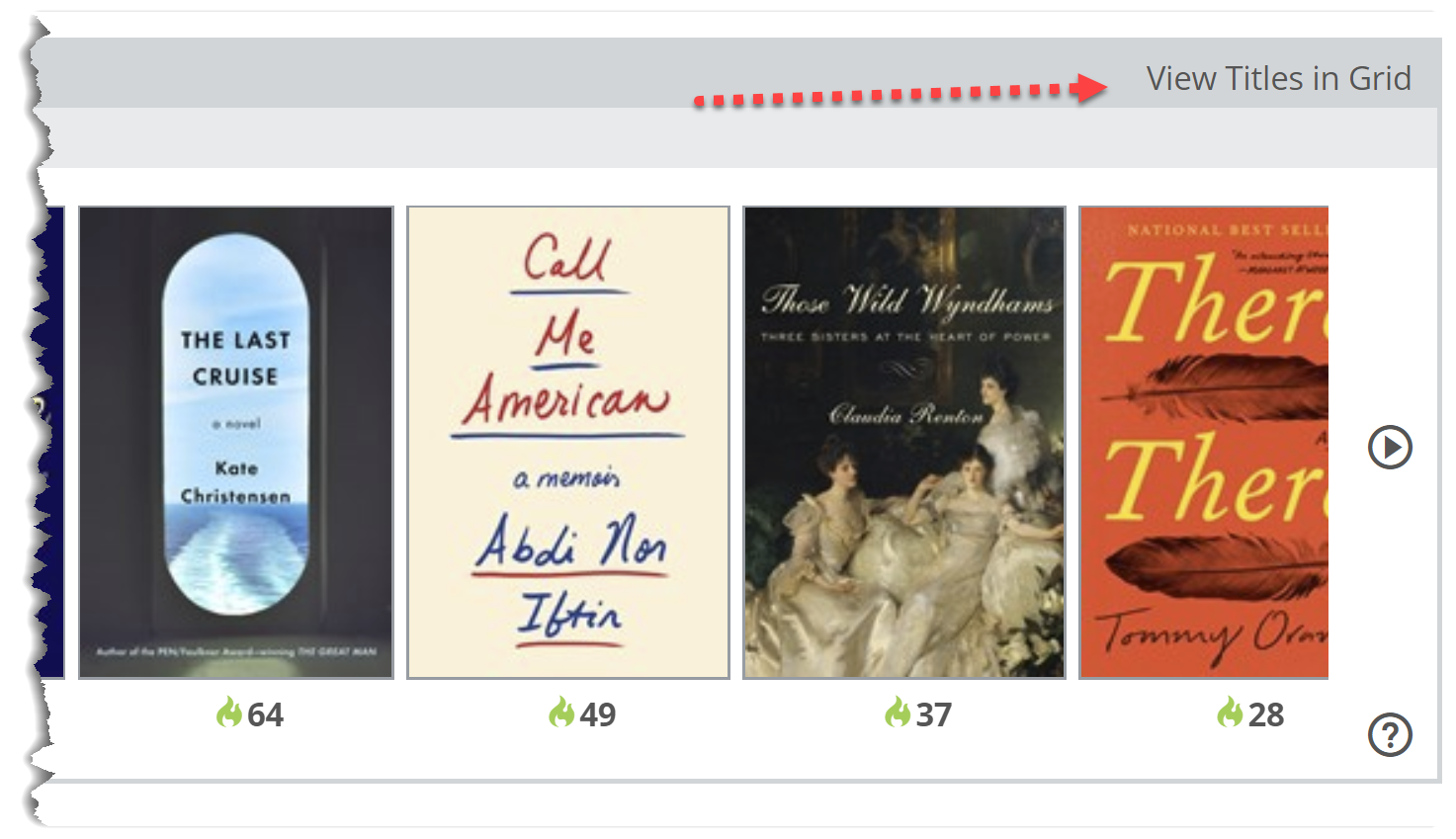
The Catalog Analysis graph is designed to show you a specific list of titles, and how those titles are performing in your library. Whether it’s an official publisher catalog or a personalized list of titles you’ve created yourself, you can see a quick visual representation of the briskness of the circulation of those titles, as well as what percentage of the list you currently own or have on order.
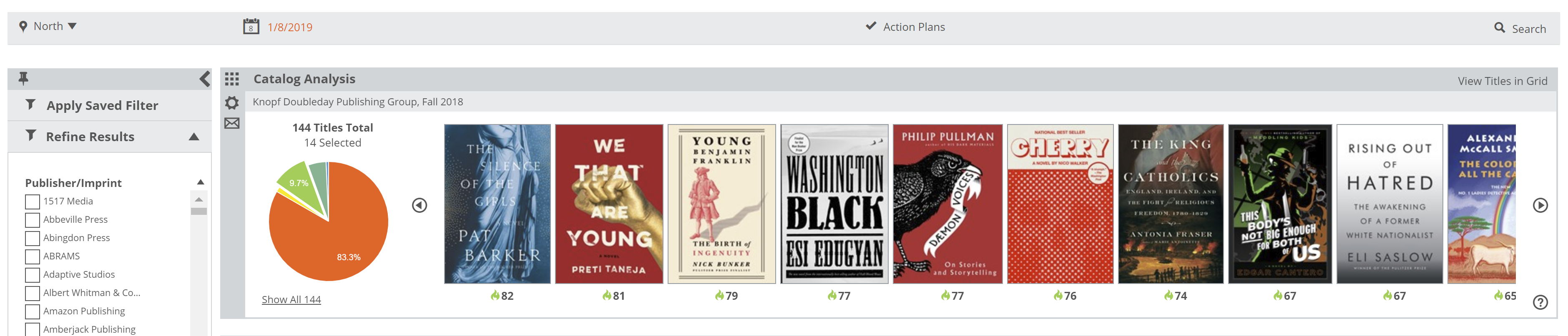
The graph will show titles that are moving briskly, moderately, or not at all, according to the last time there was any sort of activity for those titles, whether last received or last sold. This is all dictated by the Shelf Days measurement. The red area of the graph will show titles that are not owned.
Click on the area of the graph in to which you’d like to dive deeper. You’ll see a bunch of book covers, with their Shelf Days number shown below. Click on that number to see quick details, including the breakdown of the Shelf Days calculation and some market details for that title.

(This book was great, by the way.)
To see more information about these titles, you can view the Title Detail Grid by clicking here: